


2010-12-21, 05:55 PM
Is it logo or banner?
| Poll: Vote for your favorite banner! (NOT A REPLACEMENT, JUST YOUR FAVORITE OF THESE) You do not have permission to vote in this poll. |
|||
| #1 | 20 | 16.26% | |
| #2 | 4 | 3.25% | |
| #3 | 10 | 8.13% | |
| #4 | 7 | 5.69% | |
| #5 | 1 | 0.81% | |
| #6 | 35 | 28.46% | |
| #7 | 43 | 34.96% | |
| #8 | 3 | 2.44% | |
| Total | 123 vote(s) | 100% | |
| * You voted for this item. | [Show Results] |
|
Vote for your favorite Southperry banner!!!
|
   
2010-12-21, 06:20 PM
Rob Wrote:Fiel Wrote:Didn't like 7It's kinda aggressive, that's true. Problem is that the lines are... too thick. I had originally planned to submit something like number 7, but when I tried to fix the border it was a little fuzzy & choppy, so I think that's why the designer made the border thick. But anyways, the ones I made still didn't make it haha. I guess it was just too much going on or too colorful ;( Good job on the banners. The idea of number 1 is cute, but I voted for 6. Are we able to see all of the entries? 
2010-12-21, 06:31 PM
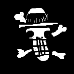
For those of you who want to preview the submissions in current context and don't care to do it yourself:
(apologies for the resized image quality, and keep in mind that spacing is dependent on the image files given and can be adjusted if admin feels it necessary)
1
2
3
4
5
6
7
8
2010-12-21, 06:37 PM
I went back and forth between 3 and 6 but ultimately I chose 3.
Too bad it can never win. 
2010-12-21, 06:44 PM
Argh. Kind of want to change my vote now. #7 is the best stand-alone image but it looks out of place. #6 fits really well and looks nice.
2010-12-21, 06:46 PM
Sarah Wrote:Argh. Kind of want to change my vote now. #7 is the best stand-alone image but it looks out of place. #6 fits really well and looks nice. THIS OH SO MUCH THIS. 
2010-12-21, 06:50 PM
2-6 are the only ones that truly look like they're not out of place, but 2-5 are far too plain and I don't like the text on 6. 7 is nice but doesn't fit in context, 8 just looks like an amateur Basil banner and 1 is the best style for Southperry, but it just doesn't seem to fit right. Ultimately and unfortunately, I'd go with 6.
 
2010-12-21, 06:55 PM
Sarah Wrote:Argh. Kind of want to change my vote now. #7 is the best stand-alone image but it looks out of place. #6 fits really well and looks nice. I agree xP  
2010-12-21, 07:01 PM
Pixie Wrote:Are we able to see all of the entries? Not until after the voting concludes. Don't want distractions or whining about who/what should've been included. Rob Wrote:Sarah Wrote:Argh. Kind of want to change my vote now. #7 is the best stand-alone image but it looks out of place. #6 fits really well and looks nice. We can always reset the votes.
It's not having what you want - It's wanting what you've got.

2010-12-21, 07:06 PM
Russt Wrote:For those of you who want to preview the submissions in current context and don't care to do it yourself: Given these, 6 fits best, 7 would work too, but there would need to be some dithering added here and there. 8....Ill be damned if I see a basilmarket-esque banner on mah southperry. 
2010-12-21, 07:09 PM
Eosian Wrote:Not until after the voting concludes. Don't want distractions or whining about who/what should've been included. Not a bad idea Eos since we are ahead of my original timeline. The way Russt did them, it does give a different perspective. I'll keep this is mind for any future related contests. Will have to reset when I get home unless you'd like to do it for me. ;P 
2010-12-21, 07:21 PM
TaliaNCo Wrote:Will have to reset when I get home unless you'd like to do it for me. ;P Think I'm the only one who can.
It's not having what you want - It's wanting what you've got.

2010-12-21, 07:24 PM
#3 is the best, but it's not better than our current. If we have to change, I'd go with #3.
1 is stupid, 8 is absolutely horrendous. 2, 4, 5 and 6 are unfitting, ugly or not good enough. 7 is overrated in its current state. It is the best overall image, but it needs work if it's going to be our banner. Doesn't fit near well enough as is.
2010-12-21, 07:31 PM
Russt Wrote:Sorry. Don't be sorry. What you did really gave me a new perspective and I'm sure it did the same for others too. It was a good idea Russt. 
|
|
« Next Oldest | Next Newest »
|
![[Image: 2FoI.jpg]](http://imm.io/media/2F/2FoI.jpg)
![[Image: 2FoL.jpg]](http://imm.io/media/2F/2FoL.jpg)
![[Image: 2FoO.jpg]](http://imm.io/media/2F/2FoO.jpg)
![[Image: 2FoR.jpg]](http://imm.io/media/2F/2FoR.jpg)
![[Image: 2FoT.jpg]](http://imm.io/media/2F/2FoT.jpg)
![[Image: 2FoU.jpg]](http://imm.io/media/2F/2FoU.jpg)
![[Image: 2FoW.jpg]](http://imm.io/media/2F/2FoW.jpg)
![[Image: 2FoX.jpg]](http://imm.io/media/2F/2FoX.jpg)